Posted on #!30Wed, 07 Jun 2023 15:54:00 +0800+08:000030#30Wed, 07 Jun 2023 15:54:00 +0800+08:00-3Asia/Shanghai3030Asia/Shanghaix30 07pm30pm-30Wed, 07 Jun 2023 15:54:00 +0800+08:003Asia/Shanghai3030Asia/Shanghaix302023Wed, 07 Jun 2023 15:54:00 +0800543546pmWednesday=6#!30Wed, 07 Jun 2023 15:54:00 +0800+08:00Asia/Shanghai6#June 7, 2023#!30Wed, 07 Jun 2023 15:54:00 +0800+08:000030#/30Wed, 07 Jun 2023 15:54:00 +0800+08:00-3Asia/Shanghai3030Asia/Shanghaix30#!30Wed, 07 Jun 2023 15:54:00 +0800+08:00Asia/Shanghai6#
Ideas and Methods for Font Binarization in Design
This article was originally written on August 6, 2022 and has been refined and re-published. It is intended to be a throwback, and feedback and comments are welcome.
First of all, we need to introduce a question: what is binarized fonts? I believe that broadly speaking, binarized fonts does not need a clear definition. However, in the context of creating pixel art and low-resolution art/design, the visual form of a binarized fonts needs a clear standard. This article is also limited to discussing binarized fonts in this context.

(Neon fonts such as the one pictured above are not part of the discussion)
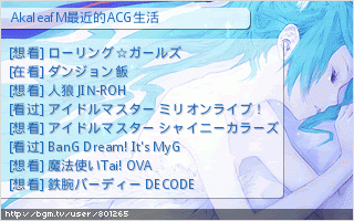
Fonts need to be "jagged" (or reduced in anti-aliasing strength) on top of the low resolution to be a retro binarized typeface. I cheekily use my visual communication assignment from my second year of college as a case study:


